New Blog
I love the holidays. It’s a time to sit back and relax for a little bit, before my routine cycle of working out-work-study-sleep begins again.
It is also a time when I like looking back at my projects, and seeing if something needs refreshing.
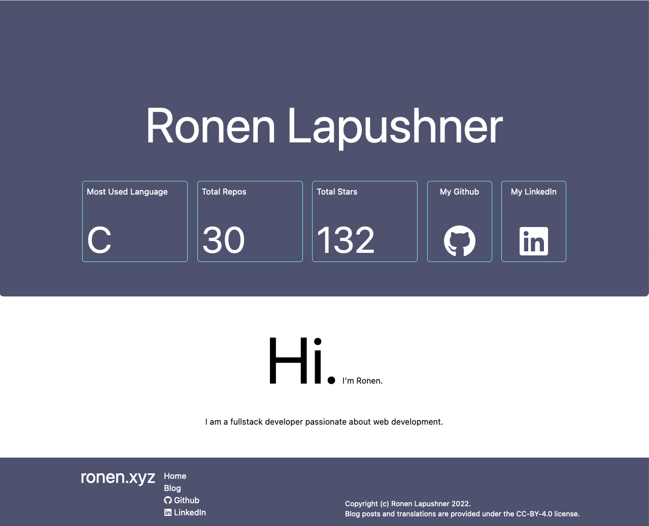
Looking back at my website, I can see that it desperately needed a makeover; First of all, the infrastructure, as described in my previous post on the matter, was a bit too complex for what it was trying to achieve. I mean, operating a CMS, a database and a Railway-deployed infra with 4 microservices was a bit too much. Don’t get me wrong - I had great time learning the JAMStack, but it is definitely an overkill for what I’m trying to accomplish here1.
And of course, the elephant in the room - it was absolutely hideous.

I was trying to go for a simplistic yet professional-looking design, but somehow ended up with something straight out of 2013. My previous site was looking very 2010, so I suppose it was a step in the right direction :-)
So instead of going out or properly finishing up my schoolwork, I decided that ronen.xyz is due a makeover.
New Stack
The previous site was based on Next.js. An excellent framework in it’s own right, but overkill for a simple blog.
This time I decided to properly pick up and use Astro. Astro is an MPA/SSG framework first and foremost, but allows easily adding client-side JS components in any framework. Although currently I have no logic running on the Client, I’ve added Solid as my framework of choice, since I’m familiar with React but want something much more lightweight in case I’d ever need it.
The static nature of the site means it does not require a database or a CMS, so I’ve removed those.
Hosting is done on Vercel - not because I don’t like Railway - but simply because Astro has a convinient plugin for it, and I’m a lazy bum who doesn’t wanna work too hard, so I went with it instead. Hopefully Astro will have a Railway plugin in the future.
New Design
This time around I wanted an even simpler design; something plain and easy to read, while looking modern and sleek.
Pablo Picasso once said that bad artists copy, while the good artists steal. Since I hold myself to the highest standard possible (usually), I went ahead and got “inspiration” from Yoshua Wuyts’ blog.
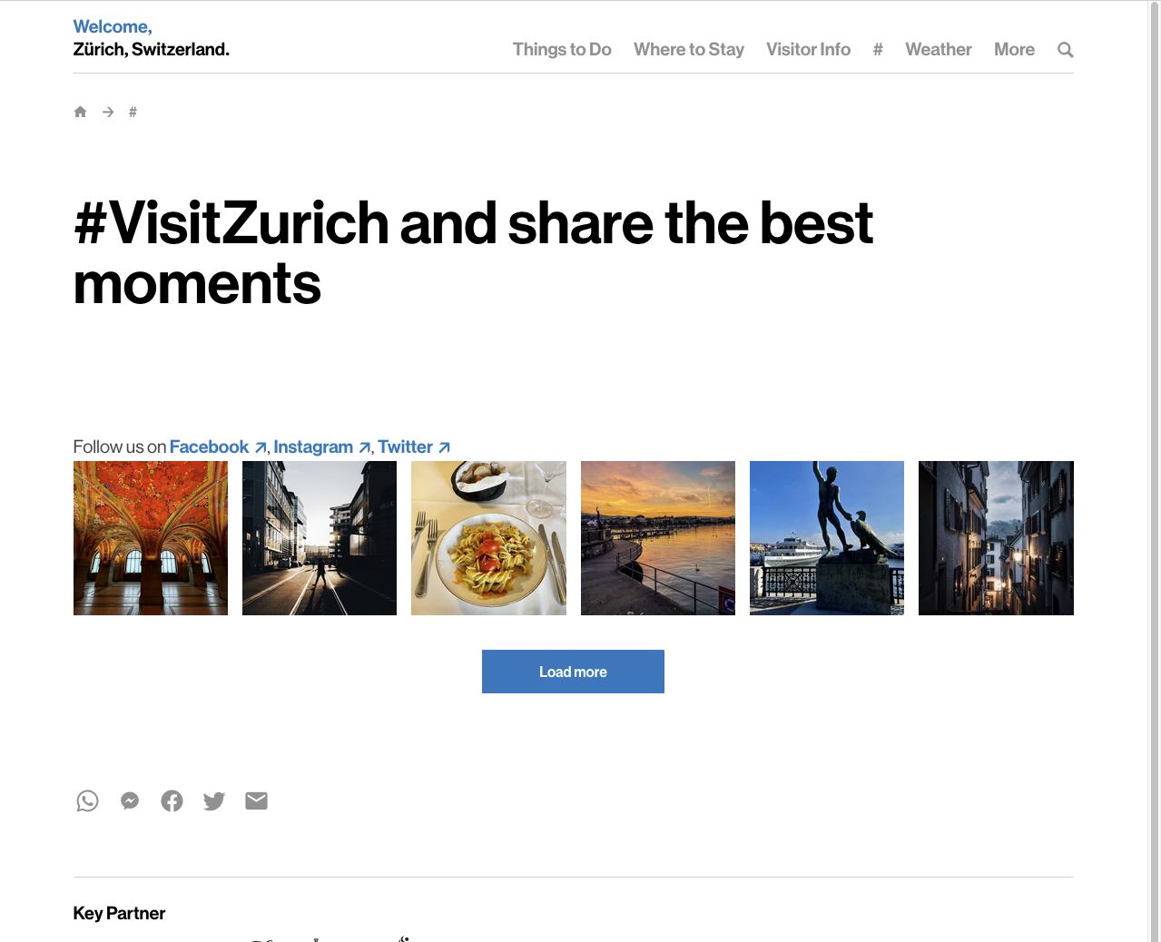
Wuyt’s blog is, in my eyes, an excellent example of a portfolio site; I love it for focusing on the content rather than the design, which is what most portfolio sites do. However, I feel like it’s missing some color, so I spruced it up with some colors I got from the Zurich Card website:

The two seemed like a perfect combo, and that’s eventually what I ended up using.
Plans for the future
In the near future I’d like to add some analytics - I’m currently eyeballing Cloudflare’s.
Notes
- In all honesty, a statically-generated site will do well here, but where’s the fun in that?